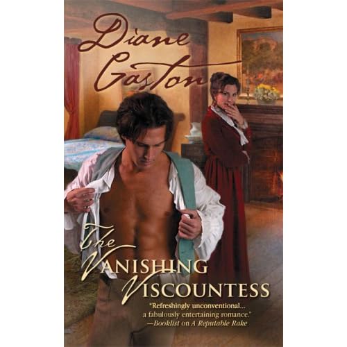
The Vanishing Viscountess (Diane Gaston, 2008) is the kind of historical romance I'm always wanting to read but am rarely fortunate enough to find. It's tightly plotted, romantic, and well-researched. Best of all, nothing feels out-of-proportion. The stakes are high--the heroine is wanted for a murder she didn't commit--but the characters' reactions are appropriate to their situation, making the story dramatic rather than over-the-top and melodramatic.
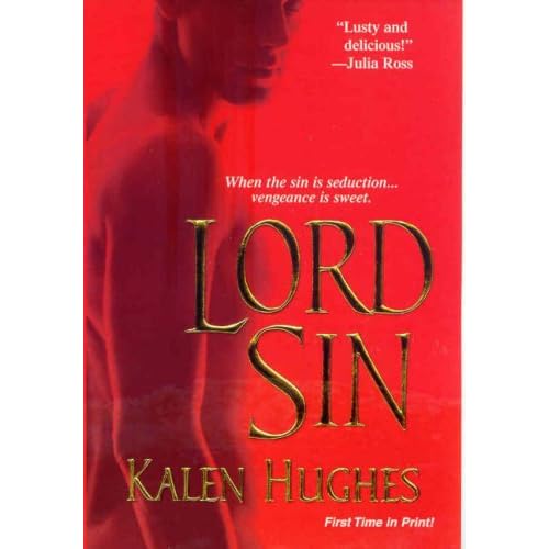
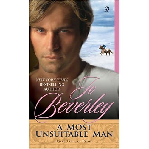
It's an excellent book, but I feel compelled to rant a bit about its cover. I'm not at all ashamed of reading romance. I'll tell anyone I talk books with that romance is among my favorite genres. I also tell them that I wrote three romance manuscripts, and that I switched genres because I think historical adventure is a better fit for my voice, the kind of heroes I write, and the stories I want to tell, not because I think it's somehow superior. But as I read The Vanishing Viscountess in the cafeteria and at the bus stop today, I made sure to hide the cover, or at least to cover the bare-chested guy, because it's just so silly and cheesy. I did the same when I was reading this book and this one.
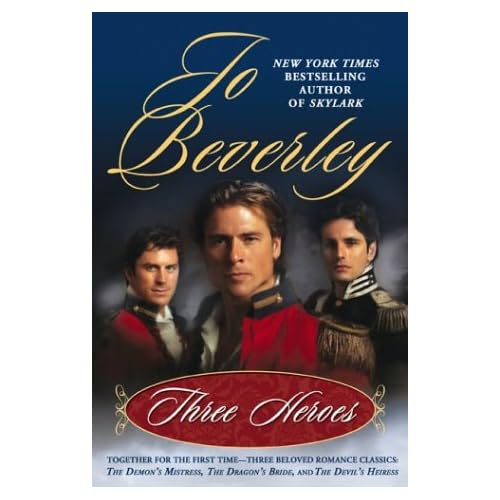
It's honestly not that I hide any and all obvious romance covers. I read this openly on a city bus, though I'm not wild about the pink. And Jo Beverley has had some gorgeous covers I'd read with pride anywhere.
But what's with the shirtlessness, or men ripping open their shirts looking like Superman on a day he forgot his tights? It's not sexy, at least not to me. You want sexy, show me fully clad Regency men, especially if they're in uniform like the ones on the second Beverley cover. Men just don't dress a quarter so well anymore! Or if you're going to show the undershirts, at least get them right. They were pullovers, with an open throat and a button or two at the top, but they didn't button all the way down. It really annoys me that romance covers UNIVERSALLY get this wrong, because it's not like it's an obscure detail, or that it would cost more to paint a period-correct shirt. And it's not like accurate shirts aren't sexy, either. Exhibit A. And though Colin Firth does nothing for me, obviously a lot of women thought he looked perfectly fine climbing out of that pond by Pemberley. So I can't come up with any explanation for why romance publishers always get this wrong except that they think women who read romance just aren't as smart and aren't as worth taking trouble over as the audience for the Sharpe series (probably at least half male, even with the Sean Bean factor bringing in the ladies) or Pride and Prejudice viewers (people who care about Great Literature).
But really. All I need are covers I don't feel the need to go into contortions to hide when I'm reading on the bus. Is that too much to ask?
Subscribe to:
Post Comments (Atom)
5 comments:
Re the mantitty covers, yes, I hear you and I feel your pain. Supposedly they sell well, though, so I doubt it is going to change. I wonder if you could cut down one of those stretchy fabric textbook covers to fit?
I'd love to find some of these readers who fuel the mantitty trend, because I just. don't. get it. It's not that I'm averse to shirtless men, you understand, but there's a time and a place for everything, and "on the cover of a book I'm going to carry around with me throughout my day" is not that place.
I've seen covers sized for mass market paperbacks, and maybe I'll get one if I can find one that's not too chintzy.
Hi, Susan!
How nice of you to mention The Vanishing Viscountess and to say such good things about it.
I'm sorry you don't like the cover, though. I absolutely LOVE the cover! It fits the story perfectly.
I can certainly agree that clinch covers with men in tattered shirts contorting with women whose bodices are dipping and skirts are rising can be embarrassing, but The Vanishing Viscountess cover fits the story. It has purpose.
And I'm a sucker for a handsome man on the cover, in his shirt or out!!
But that's just me....
I hope I wasn't too harsh on the cover, Diane, but I'm just so sick of looking at the cover of a romance and thinking, "How the h%ll am I supposed to read this in public?!" Maybe that's the difference between me and the people who enjoy clinches and mantitty--if I only read at home, it wouldn't matter very much, but at least half my reading time is during my commute or at lunch.
I really liked the image on the inner cover, though. I think if it'd been in color it would've been great for the front cover.
Susan, I really do understand your position. There are covers that I wouldn't want to be seen reading in public, too.
Gotta say thank you for putting my (the Diane Perkins me) The Improper Wife bookcover on your blog. Now that's a cover I'm sure we can both agree on! I love that cover!
Post a Comment